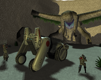


 I've stared at this for so long, I genuinely can't tell whether it is finished/any good?
So I'm just updating my progress on my main project and will of course have to mention my encounter with Mooney.
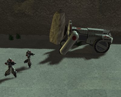
First off, I must apologise to Maya. Although it was being a difficult bastard for quite some time, it turns out that my lack of knowledge may have had something to do with my problems. Who would have thought that the more you practice with something, the better you become at using it? Weird eh. Once again Kaile very kindly came to my aid and helped me out with my cylindrical mapping issue which as expected was solved with pretty much one click of the mouse. This meant that I finally got my tank/bike finished and have done some pretty sweet renders of both it and the soldier together.

It was interesting again to see how the design of the vehicle itself had to be altered at each stage in order to suit the platform. Details such as vents and line-work on the surface armour all had to be exaggerated to look more bold to that it would stand out once the model is scaled down. I learnt here the importance of shadow and lighting to give the effect of areas raised or lowered on a surface which is in fact completely flat. The dragon symbol and 'Red Sun' design were also elements I added simply to give the bike more character. If it was a high poly model, I could afford to keep it fairly monotone like the original concept because the tiny details like panels, screws and ridges would break up the surface. As these would become invisible on such a small scale however, using symbols in bold colours like this seems to work well to give it greater visual impact. After seeing Scott's awesome car, I have been inspired to go for a more stylised look in the vein of 'GTA: Chinatown Wars' and add the thin black outline to all of the models too.
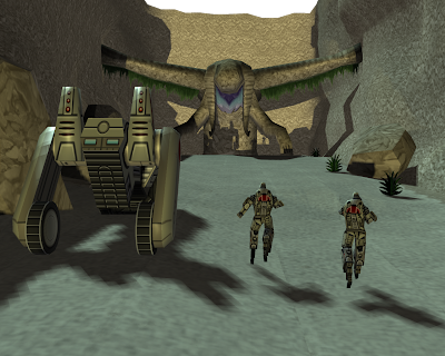
Next Josh got me started on basic animation. I have managed to get the bike to drive about with fully rotating wheels and I must say I'm pretty happy with the results. Only thing left is to sort out some terrain to import them into. So far I've had two attempts using Josh's guide from WebCT and although I pretty much get the jist of it, I'm still having small niggling problems. Getting a repeated texture to look clean over a large surface seems to be a lot more difficult than I thought.
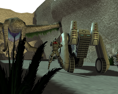
You can see in the first image, the darker brown marks make it look very obvious that I've a used a repeated pattern despite the fact that there are actually 3 separate maps for the floor alone and that they have all been flipped and rotated at random. The light coloured edges also draw focus to the square shape of each of the faces. Just bad texturing I guess - something that can be quite easily resolved.
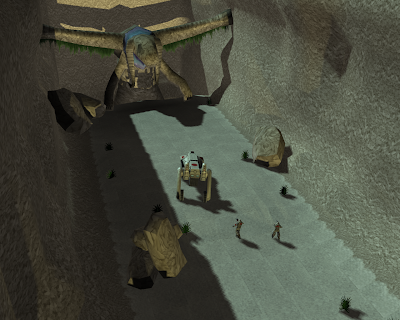
My problem with the second one came about when I tried to weld together the various objects that I had copied and pasted. I kept missing the odd edge which meant that whenever I went to manipulate the vertexes and deform the shape of the object I would keep finding holes. I thought I had cleaned the whole thing up and saved it but upon re-opening the file to take these screenshots, you can see the whole thing looks as though it's torn itself apart. Does Maya like to just mess with your models at night when there's no-one around? I can't think of a possible explanation for this and it's insanely frustrating!
Other obvious flaws in this design include the texture on the rock, which has been stretched over the whole surface of the object, rather than being applied to individual faces and the 'seams' on the floor which for some unknown reason stand out like a sore thumb.
Will my brain ever adapt to the world of 3D???
I figure it is a matter of practice, practice, practice and doing it as frequently as possible helps me to not forget all the little details I'm learning as I go. With this in mind, I'm messing around with various ideas as often as I can right now. Below are some renders of an as of yet un-textured 'Dropship' idea I have for deploying the smaller tank/bikes (I really need to come up with a name for them!) and the soldiers into battle. The final designs wouldn't be as messy as this one; I've just used the shape do demonstrate a few different means of carrying the vehicles. I think I like the one's on the wings best =) Additionally, I've started messing with a build of the bust of one of the soldiers. My first attempt at doing something that on completion will be very high poly. Perhaps it could be used for cut-scenes within the PSP game?
Not last Friday, but the one before that (Jesus, time moves quickly) Shaun Mooney from TT came in and gave us a short presentation on what he does there and a bit of an insight into the professional practice of a Concept Artist/Modeller/Designer.
I have to say I was blown away by his work. Like I said to him afterwards, what he does for a living is practically my dream job so it was one of the most important and relevant parts of the MA for me so far. He talked us through his time on the BA here at UCLan and how Josh had kicked his arse into being an awesome painter. The 4(?) years at TT which have since followed have seen him develop dramatically to a point that seems overwhelmingly distant to me, who still kinda feels like I'm just getting into the whole Games Design malarky.
What struck me most about his concepts was the speed at which he could knock them out. Don't get me wrong, they didn't suffer from the time constraints one bit. I would like to think I could probably create something of an almost equal standard after maybe 2 or 3 weeks of hard graft. He would do a few of these things every day. One of the particularly awesome paintings (of a concept for a level in a Lord of the Rings game) apparently took a mere 40mins!! He stressed the importance of using short-cuts wherever possible and really fine-tuning your own practice down to a point where you can shave hours of your development time. Such examples included manipulating the brushes in photoshop to give the impression of texture so you don't actually have to physically paint it and working in strong block colours rather than delicately building up layers of detail. It felt like both a blessing and a curse for me in that it totally inspired me and gave me loads to think about in relation to my own ways of working whist at the same time really shocking me at how far I still have to go until I reach his kind of level.
Unfortunately, I can't seem to find any examples of his stuff online and although I see he has a blog-page, my browser keeps telling me it doesn't exist anymore when it blatantly does!
Anyway, I have taken a lot of Mooney's advice on-board and although the majority of my time at the moment has been spent with Maya, I've been working on a couple of images on the side which I think are already showing an improvement from having spoken to him.
This isn't quite finished and while I'm still suffering in terms of speed (probably clocked up 2-3 hours on this already), the use of different brush types and a focus on high contrast lighting and shadow is definitely bringing a greater feeling of realism to the image ...or so I hope? =P
I'm still yet to apply it to landscapes but intend to do so asap!
One final thing he suggested was using software such as 'Colours!' (DS/iPhone) to practice whenever possible. I actually have the program on DS but unfortunately my girlfriend is moving away in two weeks and taking the DS with her so I need to procure a copy elsewhere. The program is interesting in that it lacks any kind of eraser, you are limited to only two brush types and of course a tiny virtual canvas on which to paint. In theory, working in such a way will force you to improve your raw drawing/painting skill without the help of the zillions of extra features that photoshop offers. Another neat feature includes the ability to watch the creation of your work back as a video. These can be saved and uploaded to the Colours website for others to view.
Here is Mooney's page.
You would not believe the amount of curse-words I have muttered over the past few days. If our friend Kaile is correct and there are indeed 3D Gods who 'give life and take it away' I'm almost certain that they spend the majority of their time pursuing the latter. That and I would bet that if we were to meet them in person, they would more closely resemble Satan than Jesus. They would have huge ugly grins, smurking purely as a way of mocking their victims (i.e. ME!) and would probably stroll about the place singing the 'cheeky girls' best-of collection, driving everyone who had the grave misfortune to encounter them deep into insanity.
After pretty much giving up on the cyclindrical mapping problem I was having with the bike, I figured I would instead try to rig up my soldier.
Boy was that the worst mistake I ever made.
Building the skeleton was simple, binding it to the skin just as easy, although it took AGES, I eventually mapped him out and textured him... and then we come to weighting the joints...
I probably started messing with Maya mid-afternoon yesterday and didn't go to sleep till 5am. Then I woke up at 12 today and it's taken me till round about 4pm to finally get it working. I would love to be the helpful colleague and explain exactly what I did, what went wrong and I how I resolved it so as to help out anyone else who may come up against a similar brick wall but the fact of the matter is I have absolutely no idea what happened, and why I ended up on suicide watch by this morning. I think I scrapped my efforts and started from scratch at least 3 or 4 times until Maya decided it wanted to play ball and actually do what I was telling it to. All's I can say is that my issue involved painting weights (*shudder*) and Maya's complete and utter lack of compliance...
After two whole days of tedious tweaking and relentless ball-ache I'm fairly sure I now know and could show someone exactly how you do it ...I think =S
But I'm not going to mope anymore. As I said, my issue WAS eventually resolved and thus I have fully rigged and 'animatable' soldier. Additionally through pure practice and experimentation, I've taught myself a lot about UV mapping, the shortcuts of placing pieces on top of each other and the effective method of attaching as many linked faces as possible in order to have nicely corresponding edges (if that makes sense?).

Obviously, this kind of map is pretty simple compared to anything with a significantly higher poly count so the detail is pretty minimal and I used a very basic 3 tone colour palette in order to convey highlights and shadows. I also changed the design slightly in order to make certain parts stand out more e.g the Red on the shoulder pads and back-pack. Hopefully this will make him look clearer and neater when he's displayed about 1cm in height on a PSP screen! =P
(Special thank you to Rhoda for showing me some awesome UV maps and low-poly models last Friday!)

So up to now, I've made the little guy move about and stuck him in a few different poses for the purposes of rendering. I've also stuck in a simple textured floor and added a couple of basic lights in order to get some neat shadows. Of the images shown, I'm definitely a fan of the slightly darker and more high contrast set-ups. I think they work well with the details on the armour and give a way more dramatic feel to the scene. Hopefully I can get my 'wheel' issue sorted tomorrow, texture the bike and then start putting together some proper scenarios for animation!

I shall finish off with another concept. A further attempt to convey the sheer size of the enemies in the game and give a feel of the ancient Japanese inspired landscape, open, misty and haunting.
In the shop, we've been previewing God of War III and having never played the first two (I know, I'm missing out!) I was completely unaware of the Titans. Apart from looking frikkin' awesome, they appear to be doing the same kind of thing I've been thinking about. As far as I can see, they as enemies (and allies?) provide both a landscape and target for the player. This mechanic is what I want this game to be all about so I intend to do further research into exactly how they make it work in GOW3.
...anyone got a PS3 I can borrow? =P
I quickly formed a new soldier design based on the last concept. The elongated helmet and 'stilts' were created in an attempt to form a unique silhouette. I also started to think about how these guys would navigate the games terrain.

STILTS
Apart from the aesthetic appeal, the stilts have a practical purpose, allowing the soldiers to sprint faster, jump higher and navigate dense forests, deep sand or swamps. They are extendable/hideable and may have to be earned through gameplay.
GUNS
The mountable rifle is also a mechanic in it's own right; the stock is attached to the armour on a hinge meaning that the weapon can be lifted and fired with only the right hand - leaving the left free to perform other duties such as climbing/holding, throwing grenades, using a sword/pistol, accessing equipment or opening doors/using machinery. Rather than collecting and carrying an armoury of weapons (classic shooter style) or being limited to only 2 (almost every game since Halo), you can obtain different weapon parts which can be mounted to the shoulder stock allowing for interesting combinations e.g. Assault rifle/grenade launcher, sniper rifle/grappling hook, gauss cannon/magnum etc.
OTHER WEAPONS
Since these aren't your standard kinds of soldiers, fighting your standard types of enemy, I figured I have the opportunity to create some original kinds of weapon. Although I don't have any showable images just yet, I'm thinking extendable spears/lances which could be used to impale the giant enemies or to vault deep ravines, drills/saws used to dig through armour, harpoons and various kinds of incendiaries/explosives.

POWER ARMOUR
The combat armour is also an important feature of gameplay. Made up of panels of some future metal alloy, it is packed with nano-technology which serves a multitude of purposes:
The surface is coated with thousands of micro solar panels allowing it to constantly keep charged (no worrying about charging the suit i.e. Half-life - although this could ensure interesting mechanics during long indoor areas/night-time).
On-board computers monitor brain activity and muscle co-ordination in order to follow the users movements and control an sturdy exoskeleton. This allows the user to move with absolute ease and assists in tasks such as lifting or running - easing fatigue and providing the wearer with near super-human strength (so no getting tired = unlimited sprinting(?) and super strength could allow the possibility of interesting interaction with the environment such as the ability to throw large rocks or vehicles as weapons).
Constant health monitoring means the suit is cooled or warmed accordingly, filters in the helmet provide sufficient oxygen at all times and injuries are dealt with automatically (the soldier will be able to explore areas of extreme heat/cold allowing for interesting environments and the 'filter' + onboard air supply will allow for underwater/gas/vacuum exploration. Also again noting back to the famous orange H.E.V suit, the player will be offered a bit of reasoning as to why he doesn't die immediately after falling off a massive cliff or whatever as the armour automatically administers pain-killers and a concentrated injection of nano-bots to aid the body in speedy healing of fractures/cuts etc. Maybe it might be IMPOSSIBLE to die - that's not really what the game's about after all, so why not? It may increase the feeling of puzzle solving rather than all-out war!).
Sensors in the attached weapon send feedback to the computer regarding such information as ammunition, target range, approximated target health and importantly - the direction in which the weapon is being aimed, negating the need for sights or a scope. All information is visible through the visor which also has built in magnification and a 'scan' function (similar to Metroid) where the player can scan an area or enemy and receive or store information about it on a database. For the player this would all be visible as the on-screen HUD.
Customisable webbing would give the player the opportunity to juggle how much stuff they want to carry and where abouts on their person it would be located. Possibly, the more you carry, the slower you might be and the easier to reach items are, the quicker you might be able to use them eg. grenades on the right hip would be ideal whereas, the left shoulder would just be stupid. Similarly, the pistol on the left thigh would make for a quicker draw than if it were kept on your back.

Smart camouflage (MGS4 OctoCamo? =P ) gathers visual information about the surrounding environment and replicates it on the surface of the armour at the users desire allowing for highly accurate representations and efficient hiding!
...I think I've covered everything there?... =P
So onto Maya!

After showing Josh my first designs, we talked about altering them when moving into 3D in order to make best use of the screen size that they would be showed on. Obviously if I were making a game that was going to be played on a 50-inch HDTV, I would be trying to make the models as accurate and close to the concept drawings as possible, but since they are going to be displayed on a 4 inch PSP screen I will have to adjust them accordingly to make the most important parts more visible.
Also, I've got to keep the poly count down to a minimum and this has been my first real challenge using Maya. You would think it would be easier to make a simple blocky model but I personally found it instinctual to try and include ALL the detail and so ironing out all those curvy edges and protruding shapes has been quite a challenge. Since these guys are gonna be pretty tiny on the screen, I bulked them out a little and made sure both the back and the shoulders have quite large surface areas which I can draw detail into when I texture them. Other than that, it's been pretty much the standard arms, legs and head. Maybe when I move onto Zbrush I can think about modelling individual zips, scratches in the armour and dust on the visor =P
I also did a vehicle! XD

And if I'm honest, I designed it with the format at the front of my mind and as such it is a fairly simple shape. Although I'm yet to name it, this Tank/Bike is the personal one-man ride for these soldiers and would be used in game to cover huge open areas and reach lurking enemies. As mentioned in my last post, I still have this vision of being able to bring down such creatures with ropes ala Star Wars snow speeders.
 As far as modelling was concerned I was lucky enough to have Kaile explain how to project my concepts onto flat surfaces and then build them to the exact specifications which really helped as this did actually turn out to be quite an odd shape to model. The main body is pretty much just a block, but I wanted the wheels to be able to rotate and the back legs to be hinged. Josh also suggested animating the 'ears' in order to enhance the feeling of speed while driving.
Here I had a quick go at an environmental texture. Very simple flat square with some nice painting and grass/sand texture overlays. I've photoshopped it onto a lovely picture of a PSP GO and stuck the render of the unfinished soldier in too, to give an idea of what I'm aiming to show in April. Hopefully I can get a couple of animated soldier and a Vehicle navigating one or two small terrains and possibly display them as videos on an actual PSP!
and finally ...HELP!

I have come to mapping the Bike today and got as far as Planar mapping all the flat surfaces, leaving the wheels till last. I thought it would be a simple case of Cylindrical mapping, but whenever I try, it's projecting on the wrong axis (as shown in the screenshot). I can't seem to be able to find out how to adjust this even though I'm sure it's insanely easy. If anyone can help explain what I'm doing wrong, it would be much appreciated (I have scoured the net too, to no avail!)
Also, The vehicle is actually made up of 9 separate objects which have been parented up and so far I have mapped them all to a single UV map. It has only just occurred to me that when I go to apply the textures, Maya might be expecting me to drop a separate map onto each object - is that right? or can I do it all on one? Gah!
I have begun the process of creating my soldiers skeleton and weighting all the joints but I will leave that for another day and we can all laugh at the no doubt mind-bending results! =S
...until next time...